How to create and style isometric letters
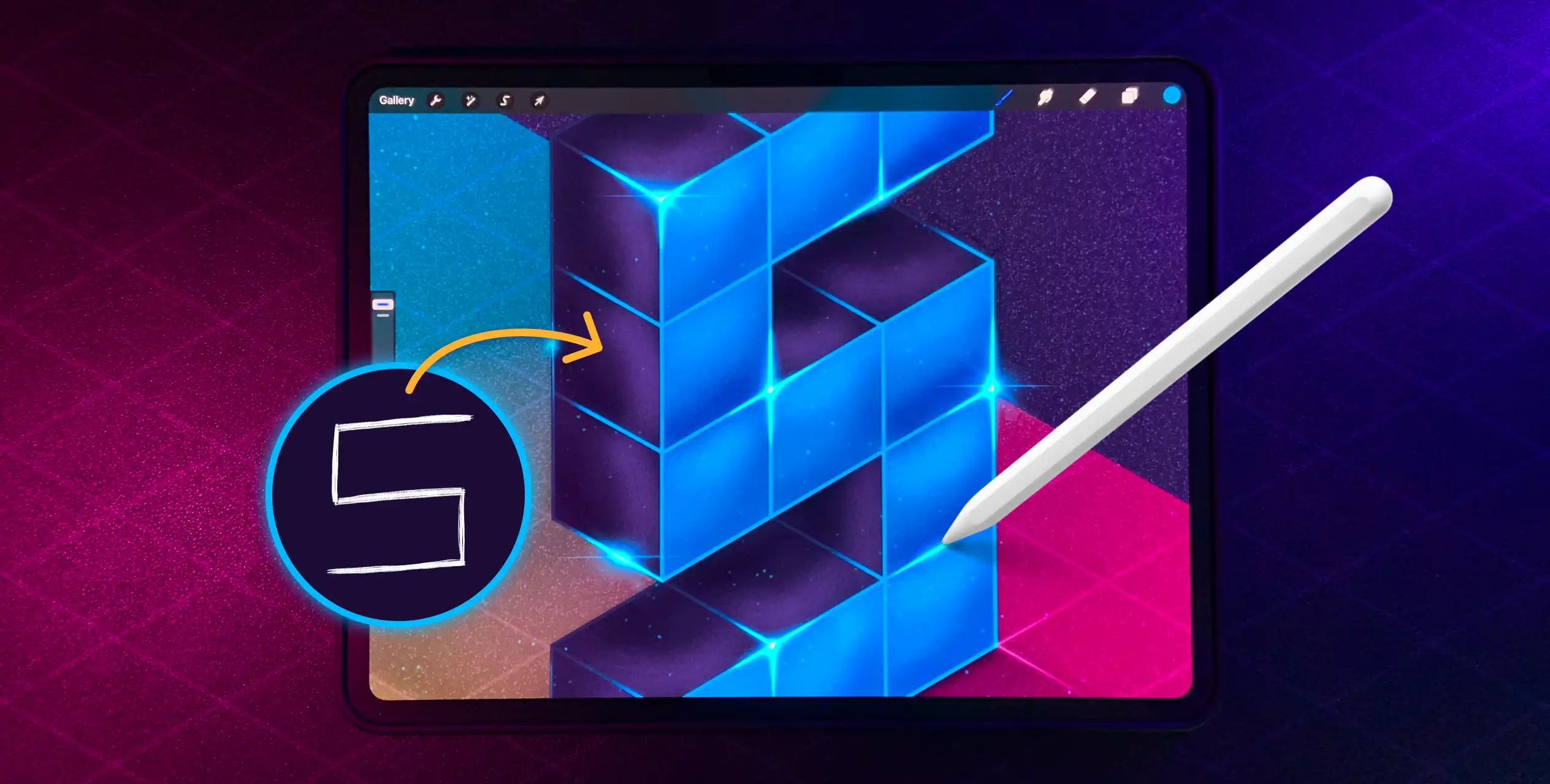
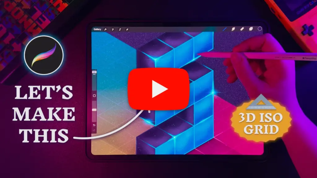
This guide is a written version of my video tutorial on creating lettering using the isometric guide lines in Procreate. From shaping a letter to adding depth and effects with blending modes.
If you’re more of a hands-on person, check out my practice file & texture brush further below.
🔖 Quick links
Building your letter ✍️
1. Set up the grid
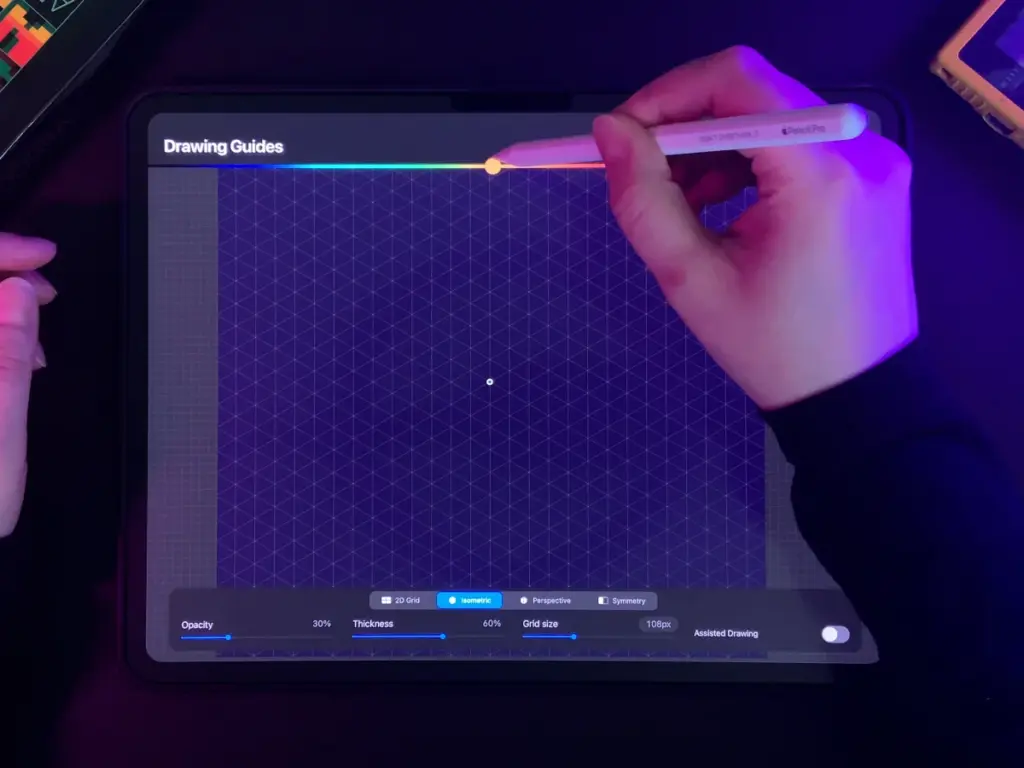
Go to “Actions” (Wretch Symbol) and activate “Drawing Guide”. Tab on “Edit Drawing Guide” to get into the settings, where you switch from “2D Grid” to “Isometric”.
I used the following settings: Opacity 31%, Thickness 29% and Grid size 150px.
Tab on the colored bar at the top to change the guide color.
You can edit all values even later on which is super helpful when the colors in your project change.
2. Sketch your letter
Scribble a letter of your choice and don’t stress about the perspective at this point. But if you feel confident, feel free to sketch it directly on the grid.
Use straight lines instead of curves like digital LED letters do.
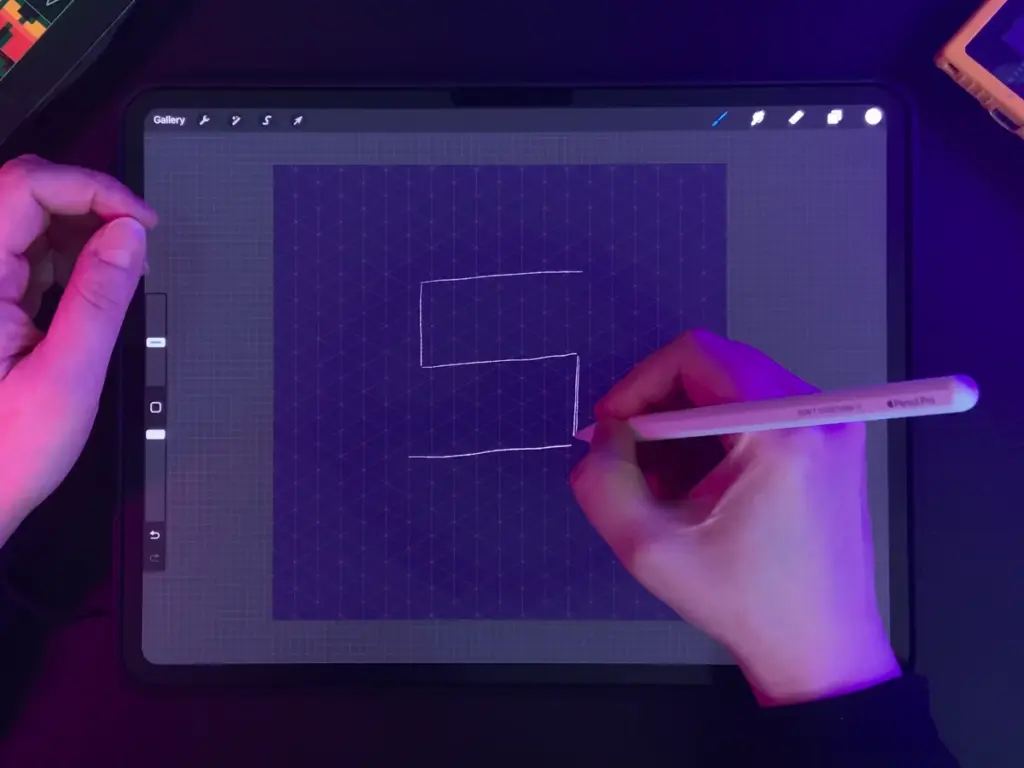
3. Shape your letter
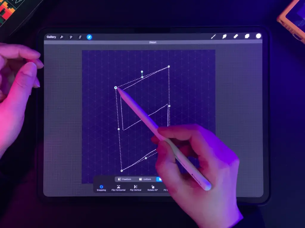
Click on “Transform” (Cursor symbol) and select “Distort”. Now you can drag the outer points of your letter’s bounding box, so that the lines sit on the isometric grids.
Try to keep the same spacing, e.g. with the letter S, I tried to keep the same space between the top, center and bottom lines of my letter.
4. Make it 3D!
Expand your line into boxes to create the front of your letter. In my case, I duplicated the line, moved it upwards and connected both lines which created a path of square boxes.
Decide the direction of your box shadow, draw vertical lines at the corners of your letter into that direction and connect all lines.
For the cube-like aesthetic, I made the front and back of my letter the same size (2×2 isometric squares).

5. Refined outline
Use any vector brush like the Monoline Brush from Procreate’s Calligraphy set (part of the Classic Library) and create a refined outline of your sketch.
ℹ️ Tip: Go back to “Edit Drawing Guide” and activate “Assisted Drawing”, so whatever you draw stays on the guides/grid.
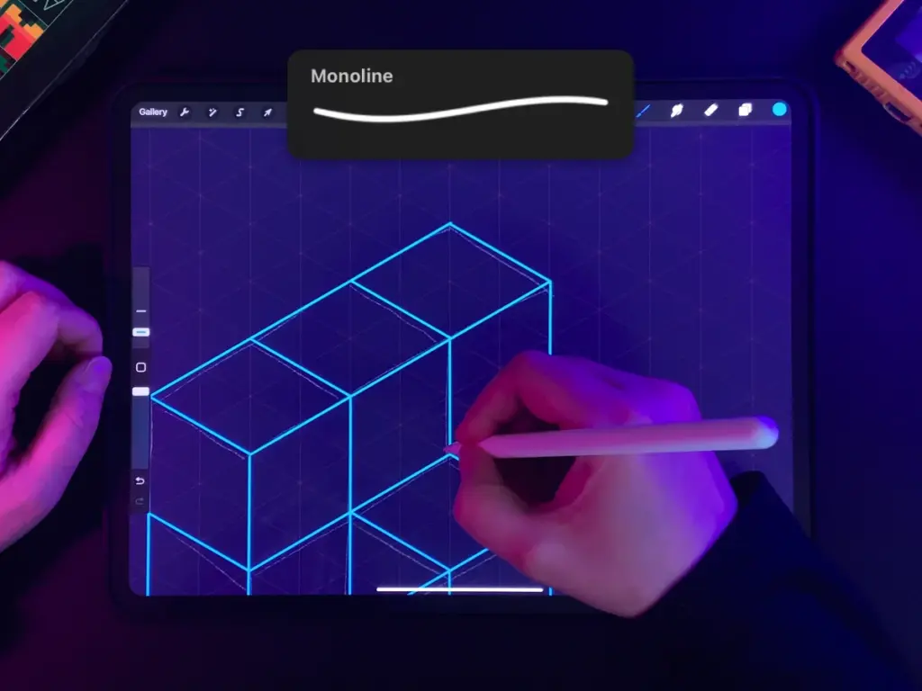
6. Fill colors
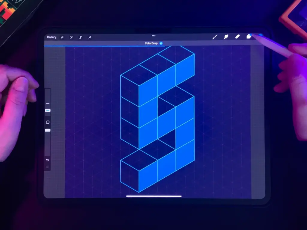
There are different ways you can add a fill to your letter but I think this is the fasted in this case:
Tap on your outline layer and select “Reference layer”.
Create a new layer underneath and drag-and-drop a lighter color only to the front part of your letter
Repeat for the shadow color (I used the same color as my background) on a new layer.
Adding dimension 🪩
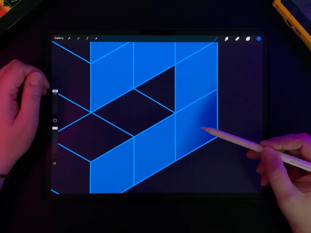
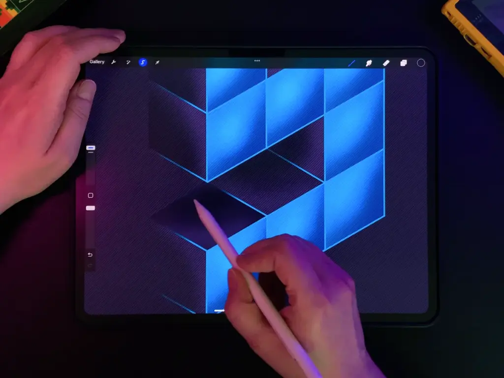
7. Front shading
- Create a new layer above the fill and set the blending mode to “Multiply” by tapping on the “N” on your layer.
- Tab on the layer again and activate “Clipping Mask”. Now everything you paint on that layer will only cover the filled area.
- With the selection tool, draw a box around one square of your letter’s front.
- Use a grainy brush like Procreate’s Spraypaints (or you can get mine below ⬇️) and gently shade only the bottom right corner of a square.
If you find your shading too strong, you can reduce the layer opacity or use a lower brush opacity.
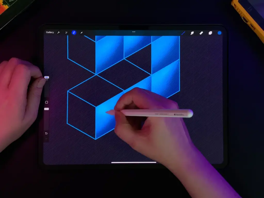
8. Front highlights
Create a new layer above the shading and set the blending mode to “Add” and make it a clipping mask as well.
Follow the same steps as for shading, but in the opposite corner.
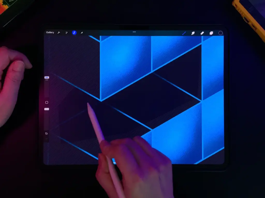
9. Outline shading
Add a clipping mask to the outline layer as well.
Use the same grainy brush with the shadow’s fill color and only cover the back part (about half a square) of the outlines.
This makes the outlines blend in with your letter and give the whole illustration a more dramatic look.
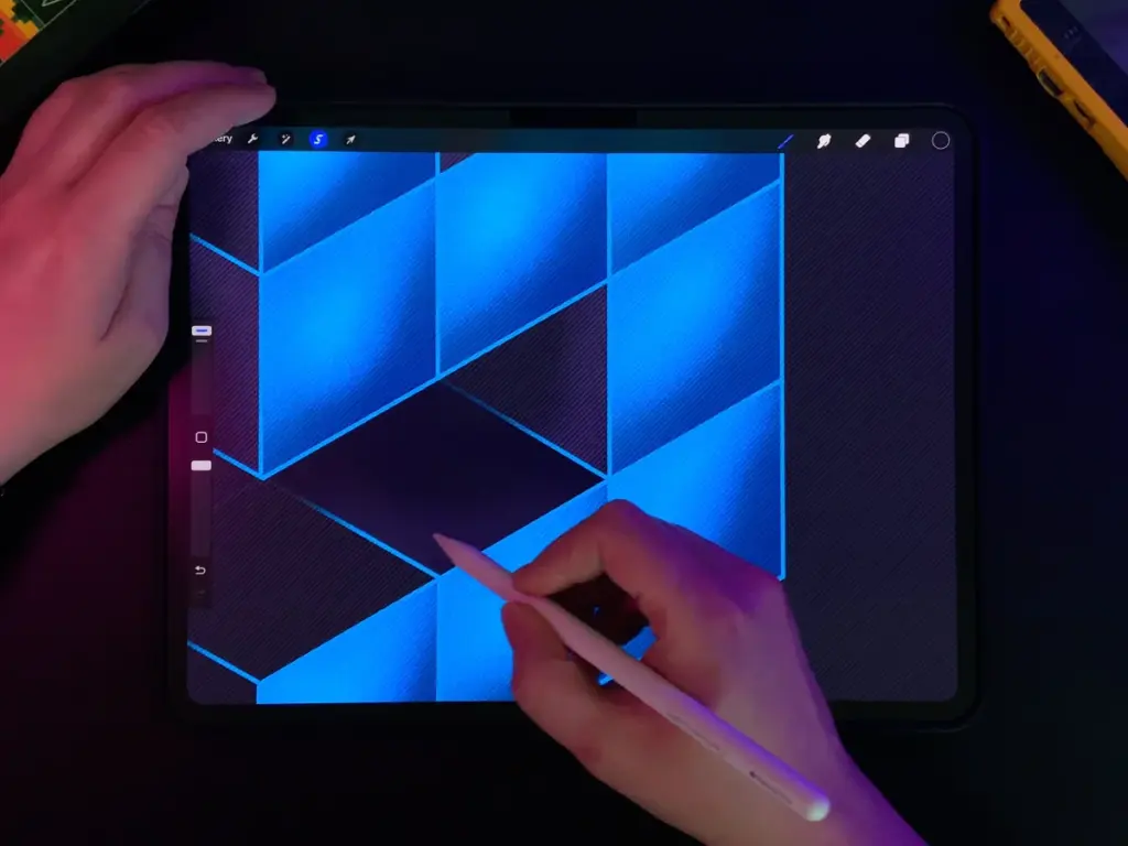
10. Shadow highlight
To make the depth of the letter a bit more interesting, you can add a bit of highlights and shading to the shadow as well.
To do so, you might have guessed it, add a clipping mask layer set to “Add” and use the selection tool to separate areas.
Lightly brush over the front edges of the shadow. Basically anywhere next to the highlights of your letter’s front. Also, you can emphasize the lines a bit more.
11. Shadow shading
Same game: Clipping mask on the shadow’s fill layer and set it to “Multiply”. Select the area you want to shade and color the back part of the shadow.
Align with the shading on the outline.
Final touches 💫
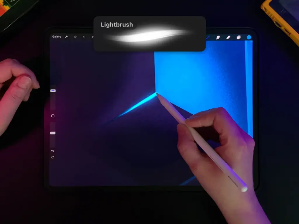
12. Line lights
- Add a new layer to the top of the layer panel (Call me crazy but no clipping mask this time!). Set the blending mode to “Add” and select the same color as your front fill.
- Select the Lightpen brush from the Classic Library’s Luminance set.
- Start with light pressure at the center of a line, increase it towards the corners and connect the intersections.
The Lightpen brush is pressure sensitive which makes strokes thicker or thinner depending on the pressure you use. It might take a moment of practice.
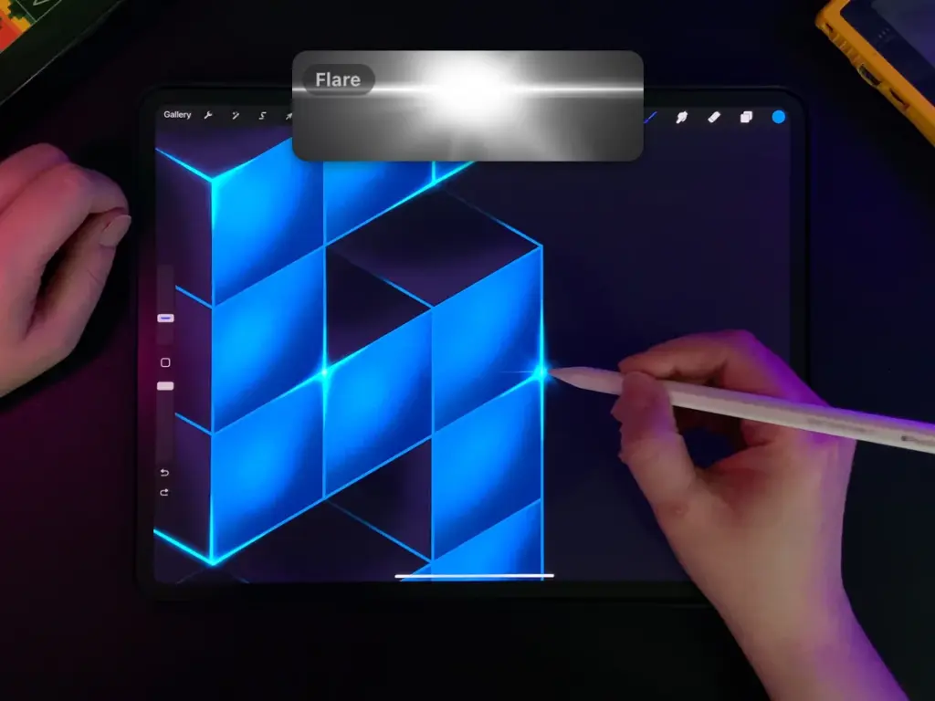
13. Sparkles
- Add a new layer on top and set it to “Add”.
- Select the Flare brush from the Classic Library’s Luminance set.
- Place sparkles at the corners and edges where the highlight lines meet (but don’t overdo it unless you want your letter to look like a party cactus).
The Flare brush works like a stamp and is pressure sensitive as well. Pressing more or less defines the intensity of your brush. However sometimes, even with light pressure, the brush goes crazy. So you might want to play around a bit.
Try different brush sizes, and place a few larger and a few smaller sparcles to create a balanced look.
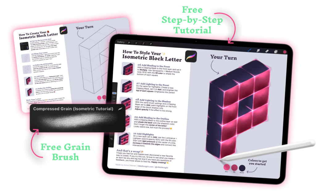
Free Grain Brush + Procreate Guide
Sign up to my newsletter and get a step-by-step practice file for Procreate and the grain brush I used for highlights and shading effects.
More posts you might like
Procreate “cheats”, that aren’t really cheating…
A constantly growing list of hacks, features and functions that make working with Procreate easier and smoothen my workflow.
Resize pixel art without breaking in Procreate
Putting one of the biggest mysteries to rest: How do I actually scale pixel art properly in Procreate without turning it into a pixel mess?
Canvas setup for pixel art in Procreate
What’s a good size when starting with pixel art in Procreate? Here are my go-to settings, I use when creating a new pixel project.